Color theory for interior design.
Color theory is an extremely important part of design. Understanding the basics of color theory can help to create visually appealing and balanced designs. Color theory consists of three parts - hue, value, and saturation. Don't worry, we're going to break it down for you!
Hue is the name of the color, such as red, yellow, or blue. Value refers to the lightness or darkness of the color, from white to black, and saturation is how vivid or intense the color is, from dull to vibrant.
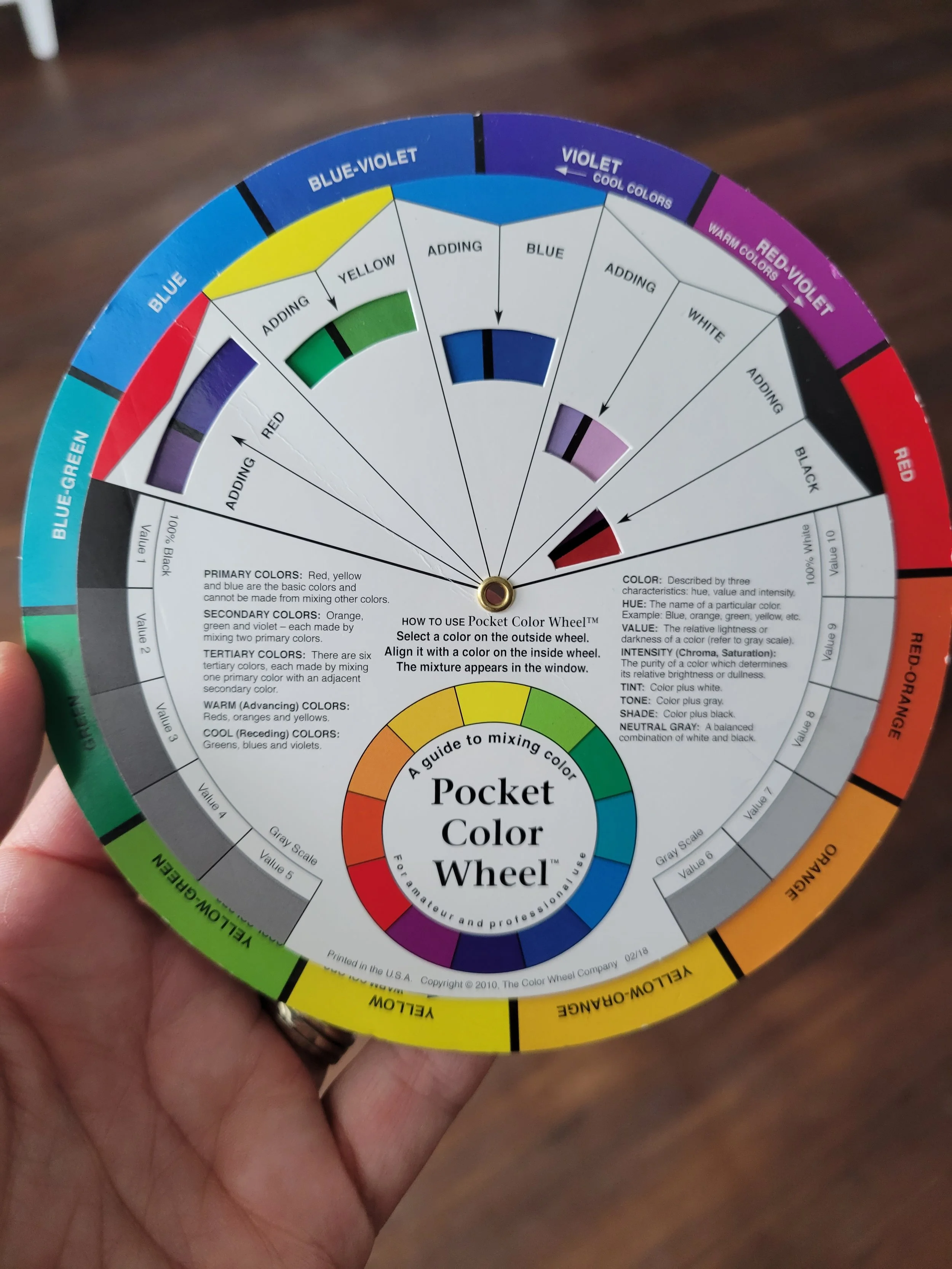
Color theory also involves the use of the color wheel, which helps to identify colors that work well together. Check out the graphics below for a visual example of the color wheel and color schemes.
Color Wheel
Color schemes such as monochromatic where you use the same color all over, analogous where you use similar colors, complementary which is using colors that are opposite of one another on the color wheel, split complementary where you use one color and one or both of the colors that sit on the opposite of the complimentary color , and triadic focusing on one color with two additional colors added, help to create a balanced design.
For now we are going to focus on complementary, split complementary, and monochromatic color schemes.
Using the color wheel to find color schemes.
Complementary colors
Complementary colors are any two colors which are opposite each other on the color wheel. Using complementary colors can give a vibrant, eye-catching look to any project. Here are some tips for using complementary colors in your designs:
Use a strong, bright, and intense color for the main color, and a softer and more muted shade for the complementary color.
Create contrast by using two different values of the same color. For example, use a light blue and a dark blue.
Create a balanced design by using equal amounts of each color.
Use complementary colors to create visual interest in your design.
Use a limited palette of complementary colors to create a unified look.
Split complementary colors
Split complementary color schemes provide a great way to add interest to a design. To get the most out of them, here are some tips:
Consider the context of the design. Split complementary colors can be used to draw attention to a particular element, think focal point.
Combine colors with different values. A split complementary scheme is more effective when you combine colors that have different tints and shades.
Balance the colors. Use a balance of cool and warm colors to create a harmonious design.
Use a dominant color. Pick one of the colors to be the dominant color in the design and use the other two colors to add accents.
Create contrast. To make your design stand out, create contrast between the colors, such as light and dark or bright and muted.
Monochromatic color
Balance the tones - When using a monochromatic color palette, it is important to create a balance between light and dark tones. You can do this by incorporating different shades and tints of the same color or using different textures or materials.
Add a pop of color - Introducing a single, vibrant accent color can add a great visual impact to a monochromatic scheme. This could be done with a single piece of furniture or a few decorative accessories.
Use texture - Texture is an important element when decorating with a monochromatic color palette. Introducing different textures, such as using a velvet sofa with a shag rug, helps to create visual interest and add depth to the overall design.
Incorporate metallics - Adding metallics such as gold, silver, or copper can bring a touch of glamour to a monochromatic scheme. This can be done with accent pieces such as lamps, frames, or mirrors.
Use natural elements - Introducing natural elements such as wood, stone, or plants can add warmth and texture to a monochromatic space. This can be done with furniture, wall art, or other decorative pieces.
Using the right colors in the right way can really make a design stand out! At JoySpace we absolutely LOVE color, and even more we help clients LOVE the colors in their own home. Let us know if we can help you bring some more Joy into your space!


